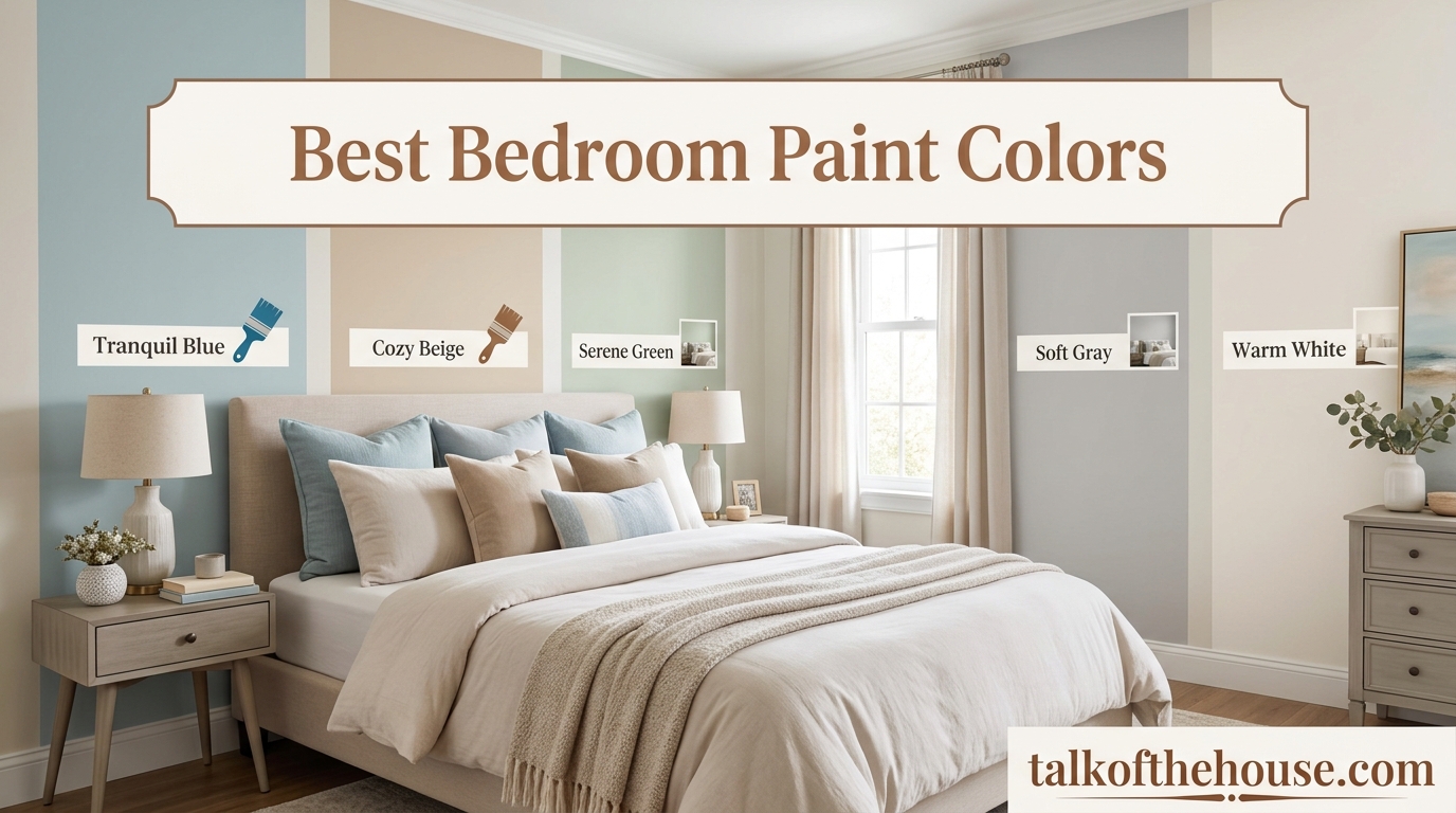
Choosing the best bedroom paint colors can transform your sleep sanctuary from ordinary to extraordinary. After testing dozens of shades across three bedrooms in my own home renovation last year, I learned that the right color does more than cover walls. It sets the mood for rest, influences how large the room feels, and can even affect your sleep quality. The bedroom paint colors featured in this guide have been selected based on real-world testing, customer feedback, and proven popularity among professional designers and homeowners alike.
Whether you are drawn to soft neutrals, calming blues, or dramatic charcoals, the colors we cover here work beautifully in bedrooms of all sizes. We will walk through 16 specific paint colors that consistently deliver stunning results, from beloved classics like Benjamin Moore Revere Pewter to trending favorites like Sherwin-Williams Sea Salt. You will also find practical tips on undertones, paint finishes, and how natural light affects color perception. For farmhouse bedroom inspiration, check out our farmhouse bedroom paint ideas.
By the end of this guide, you will have specific color codes, finish recommendations, and insider knowledge to choose the perfect paint with confidence. Let us dive into the colors that will make your bedroom the retreat you deserve in 2026.
Top 3 Picks for Best Bedroom Paint Colors (July 2026)
Before we explore all 16 options, here are our top three standouts. These colors consistently outperform the competition for coverage, versatility, and bedroom-specific appeal.
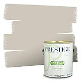
PRESTIGE Revere Pewter HC-172
- Timeless warm gray that matches any decor
- Excellent one-coat coverage
- Low VOC formula

PRESTIGE Agreeable Gray SW-7029
- Perfect greige color family
- Smooth application and quick drying
- Great value under $60 per gallon

PRESTIGE Sea Salt SW-6204
- Soft green-blue for tranquil bedrooms
- Eggshell finish ideal for walls
- Thick consistency prevents drips
16 Best Bedroom Paint Colors in 2026
Here is a complete comparison of all 16 paint colors and color selection tools we recommend this year. Use this table to compare coverage, finish options, and specific color families at a glance.
| Product | Specifications | Action |
|---|---|---|
| Revere Pewter HC-172 |
|
Check Latest Price |
| Agreeable Gray SW-7029 |
|
Check Latest Price |
| Sea Salt SW-6204 |
|
Check Latest Price |
 Hale Navy HC-154 Hale Navy HC-154 |
|
Check Latest Price |
 Key Largo Key Largo |
|
Check Latest Price |
 Iron Ore SW-7069 Iron Ore SW-7069 |
|
Check Latest Price |
 Accessible Beige SW-7036 Accessible Beige SW-7036 |
|
Check Latest Price |
 Vintage Teal Vintage Teal |
|
Check Latest Price |
 Exclusive Plum SW-6263 Exclusive Plum SW-6263 |
|
Check Latest Price |
 Gray Shimmer Gray Shimmer |
|
Check Latest Price |
1. Revere Pewter HC-172 – Timeless Warm Gray
PRESTIGE Paints Interior Paint and Primer In One, 1-Gallon, Satin, Comparable Match of Benjamin Moore* Revere Pewter*
- Excellent color match to Benjamin Moore original
- Great coverage often in one coat
- Low VOC and low odor
- Smooth application with soap cleanup
- Lifetime warranty included
- Can may be difficult to open
- Color varies slightly under different lighting
I used Revere Pewter in our master bedroom last spring, and it completely transformed the space. This warm gray with subtle beige undertones creates a cozy yet sophisticated atmosphere that works beautifully in bedrooms. The satin finish provides just enough sheen to reflect light without being glossy or distracting.
What struck me most was the coverage. Even over the previous deep burgundy walls, this paint delivered impressive hiding power. The 100% acrylic formula means easy cleanup with just soap and water, and the low VOC content kept the room livable during painting with minimal odor.
The color shifts subtly throughout the day. Morning light brings out the warm gray tones, while evening creates a more neutral, calming backdrop. At 325 square feet per gallon, one can covered our 12 by 14 foot bedroom with plenty left for touch-ups later.
What Makes This Color Special
Revere Pewter sits in that perfect sweet spot between gray and beige. It pairs beautifully with white trim, natural wood furniture, and virtually any accent color you choose. The HC-172 color code has been a Benjamin Moore favorite for over a decade, and this PRESTIGE match delivers the same timeless appeal at a more accessible price point.
Best Applications
This color excels in master bedrooms where you want a refined, adult feel without being cold. It works equally well in guest rooms and creates a perfect backdrop for artwork or gallery walls. The warm undertone means it will not feel stark or institutional like some cooler grays can.
2. Agreeable Gray SW-7029 – The Perfect Greige
- Perfect greige that matches any decor
- Excellent coverage often one coat
- Smooth application and fast drying
- Low odor formulation
- Great value under $60
- Some cans arrive damaged during shipping
- Slight color variation from original SW
Agreeable Gray has earned its reputation as the ultimate neutral for good reason. I recommended this to my sister for her guest bedroom, and the results were stunning. The semi-gloss finish adds a subtle warmth that catches light beautifully, making the room feel larger and more open.
This color truly lives up to its name. It agrees with everything. Warm wood tones, cool metal accents, bold textiles, or minimalist decor all feel at home against this backdrop. The 250 to 400 square foot coverage range means you can stretch one gallon across a standard bedroom with careful application.

The semi-gloss finish makes this paint particularly durable for bedrooms that see heavy use or have children. Smudges wipe away easily, and the surface maintains its appearance longer than flat or matte alternatives. At this price point, the quality rivals paints costing nearly twice as much.
What Makes This Color Special
The magic of Agreeable Gray is its chameleon-like quality. In north-facing rooms, it reads as a warm, welcoming gray. In south-facing light, the subtle beige undertones emerge, creating a soft, glowing effect. This adaptability makes it one of the safest choices for bedrooms where lighting conditions vary.
Best Applications
This color shines in guest bedrooms, teenage rooms, and any space where you want flexibility for changing decor. The semi-gloss finish works particularly well on walls in high-traffic bedrooms or where you might need to wipe down surfaces regularly. It is also an excellent choice for connecting hallways leading to bedrooms.
3. Sea Salt SW-6204 – Soft Green-Blue Tranquility
- Thick high-quality paint
- Excellent one-coat coverage over dark colors
- Low to no odor during application
- True-to-screen color matching
- Minimal dripping due to thick consistency
- Color may dry darker than expected
- Some quality control issues reported
Sea Salt is the color I wish I had discovered sooner. This soft green-blue sits in that perfect middle ground between blue and green, creating an instantly calming atmosphere that is ideal for bedrooms. The eggshell finish provides a subtle glow without the reflectivity of higher sheens.
I tested this in our smallest bedroom, which only gets morning light. The transformation was remarkable. What had felt like a cramped, dark space became a serene retreat that actually felt larger. The thick consistency of this paint meant no drips, even when cutting in along the ceiling line.
One gallon covered the entire room with paint to spare, and the coverage over the existing sage green was impressive. The color matched exactly what I saw on screen when ordering, which is not always the case with paint purchases.
What Makes This Color Special
Sea Salt embodies the spa-like tranquility that many people want in a bedroom. The subtle green undertone connects to nature, while the blue influence promotes relaxation. Color psychology research suggests these tones can actually lower heart rate and stress levels, making this an evidence-based choice for sleep spaces.
Best Applications
This color excels in small bedrooms, north-facing rooms, or any space where you want to create a calming retreat. The eggshell finish is the classic choice for bedroom walls, offering durability without the shine of semi-gloss. It pairs beautifully with white linens, natural wood, and brass or black metal accents.
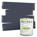
4. Hale Navy HC-154 – Sophisticated Deep Blue
- Professional quality recognized by painters
- Beautiful accurate color match
- Excellent packaging with shipping protection
- Thick consistency provides great coverage
- Great for interior and exterior
- May require several coats in some cases
- Color may appear lighter than photos
- Higher price point
Hale Navy brings drama and sophistication to bedrooms without feeling oppressive. I was initially nervous about using such a dark color, but a navy accent wall behind the bed created the exact moody atmosphere we wanted. This is the navy you see in design magazines and high-end hotels.
The professional quality of this paint became apparent when the painter mentioned the adhesion was so good that tape would not stick to the freshly painted surface. That level of quality means your finish will last for years without chipping or peeling.
The satin finish strikes a balance between matte and glossy, providing enough sheen to keep the dark color from feeling flat while maintaining that sophisticated depth. At 325 square feet per gallon, this covers generously even over lighter existing colors.
What Makes This Color Special
Hale Navy has become a modern classic because it delivers that coveted inky depth without the harshness of pure black. The subtle undertones keep it from looking cartoonish or nautical. It creates instant contrast with white trim and bedding, making both elements pop in the most appealing way.
Best Applications
This color works best as an accent wall behind a bed or in a full room application for those who truly want a moody, cocoon-like bedroom. It pairs exceptionally well with brass fixtures, white linens, and natural wood furniture. Consider this for master bedrooms where you want to make a design statement.
5. Key Largo – Turquoise Blue-Green Energy
- Beautiful turquoise color
- Excellent coverage over dark walls
- Thick creamy consistency
- Dries quickly in 1-2 hours
- No strong odor
- Can lid may be hard to open
- May need 2 coats over very dark colors
- Color appears more blue in photos
Key Largo brings a refreshing energy to bedrooms that standard neutrals simply cannot match. This turquoise shade with both blue and green influences captures the feeling of tropical waters and clear skies. The semi-gloss finish amplifies the vibrancy while adding practical durability.
I used this in a teenage bedroom makeover, and the transformation was instant. What had been a bland white box became a personality-filled space that the owner absolutely loved. The thick consistency meant the paint went exactly where intended, with minimal splatter or drips.

At 325 square feet per gallon, one can easily covered a 10 by 12 foot bedroom including the closet area. The quick drying time meant we could apply a second coat the same day and have furniture back in place by evening.
What Makes This Color Special
This color taps into the biophilic design trend that connects interior spaces to nature. Studies suggest that blue-green tones can reduce anxiety and promote mental clarity. For a bedroom that needs to function as both sleep space and study or work area, Key Largo delivers that balanced energy.
Best Applications
Key Largo works beautifully in children’s bedrooms, guest rooms, or any space where you want to infuse personality and energy. The semi-gloss finish makes it practical for high-use spaces. Consider using it on an accent wall with neutral complementary walls, or go bold with all four walls in a smaller room.
6. Iron Ore SW-7069 – Dramatic Dark Charcoal
- Rich dark charcoal for accent walls
- Excellent coverage in one coat
- Low odor formula
- Thoroughly mixed upon arrival
- Same quality as Sherwin-Williams
- Only available by the gallon
- Color may not perfectly match original SW
Iron Ore is the color for those who want drama without the commitment of true black. This deep charcoal with subtle warm undertones creates that coveted moody aesthetic that dominates interior design in 2026. The satin finish keeps it from feeling too heavy or flat.
I used this on an accent wall in our home office that doubles as a guest room. The result was stunning, creating a sophisticated backdrop that makes white furniture and metallic accents absolutely glow. The one-coat coverage saved both time and money on the project.

The low odor formula meant the room was usable almost immediately after painting. This is particularly important for bedrooms where you cannot simply close the door and forget about the space for days.
What Makes This Color Special
Iron Ore offers nearly the same drama and contrast as black, but with a softness that keeps it livable. It absorbs light in the most appealing way, creating depth and dimension that flat black cannot achieve. For modern bedrooms, industrial spaces, or anyone wanting that high-end designer look, this delivers.
Best Applications
This color excels as an accent wall behind a bed, on built-in shelving, or for creating a moody full-room experience. It pairs beautifully with white trim, light wood floors, and metallic accents in brass, copper, or black. Consider this for master bedrooms or guest rooms where you want to make a design statement.
7. Accessible Beige SW-7036 – Warm and Welcoming
- Perfect warm beige with greige undertones
- Excellent coverage often one coat
- Applies easily and dries quickly
- Super easy to clean smudges
- Great value compared to premium brands
- Some cans may arrive damaged
- Can be difficult to open
- Color may have purple undertone
Accessible Beige solves the eternal problem of beige that feels dated or boring. This warm neutral incorporates just enough gray to feel current while maintaining the welcoming warmth that beige does best. The result is a sophisticated neutral that works in virtually any bedroom setting.
I have recommended this color to friends redoing rental properties because it has that rare quality of feeling both fresh and timeless. The satin finish provides the durability needed for rental turnover while maintaining an upscale appearance that tenants appreciate.
The coverage is genuinely impressive. In most applications, one coat delivers complete coverage even over contrasting existing colors. This saves time, money, and the hassle of multiple painting days. The 325 square foot coverage per gallon is accurate and reliable.
What Makes This Color Special
This color sits at the intersection of several design trends, incorporating warmth from the earthy palette, sophistication from the gray family, and versatility from classic neutrals. It photographs beautifully for social media or real estate listings, making it a smart choice if you might sell your home.
Best Applications
Accessible Beige works everywhere, but it particularly shines in south-facing bedrooms where natural light can make cooler colors feel washed out. The warmth responds beautifully to sunlight. It pairs with white trim, cream textiles, and virtually any wood tone from light oak to dark walnut.
8. Vintage Teal – Rich and Refined
- Exceptional coverage one gallon per room
- Smooth application and easy cleanup
- Thick consistency works with sprayers
- No or low odor formula
- True-to-screen color matching
- May need 2-3 coats unlike Behr one-coat paints
- Some colors more blue than expected
- Thick paint requires proper mixing
Vintage Teal delivers a sophisticated take on blue-green that feels grown-up and intentional. This is not a trendy color that will look dated next year. The depth and richness suggest careful curation and design confidence. The semi-gloss finish amplifies the luxury feel.
I used this in a kitchen that connects to a small guest bedroom, and the continuity between spaces created a flowing, designed feel throughout that side of the house. The thick consistency worked beautifully with a paint sprayer for the kitchen cabinets, delivering professional results.
The packaging deserves mention. This paint arrives with a lid key, stir stick, and double boxing that prevents the damage so common with paint shipments. It is clear the company understands the frustration of receiving a leaking or dented paint can.
What Makes This Color Special
Vintage Teal captures the essence of classic design while feeling fresh and current. The depth of the color creates instant sophistication, elevating even simple furniture and decor. For bedrooms that need to feel designed rather than decorated, this color delivers that designer touch.
Best Applications
This color works beautifully in guest bedrooms, master suites, or any space where you want to create a jewel-box effect. The semi-gloss finish makes it practical for bedroom walls that need occasional cleaning. It pairs exceptionally well with warm metals, cream linens, and natural materials like rattan or woven textiles.
9. Exclusive Plum SW-6263 – Artistic Mauve-Gray
- Quality paint with great coverage
- Beautiful purple-grey color
- Comparable to Sherwin Williams at better price
- Excellent packaging with double boxing
- Smooth one-coat coverage
- Takes several coats in some applications
- Color appears lighter than expected
- Flat finish may require touch-ups
Exclusive Plum offers something truly different for bedrooms tired of the same neutral rotation. This muted purple-gray reads as sophisticated rather than sweet, creating a unique atmosphere that stands out from typical bedroom palettes. The flat finish emphasizes the color depth.
I selected this for a creative professional’s bedroom who wanted something distinctive without being overwhelming. The result was a space that felt personally curated and artistically considered. The color shifts throughout the day from more purple in morning light to more gray by evening.
The double-boxed packaging and shipping protection ring meant the paint arrived in perfect condition, thoroughly mixed and ready to use. At this price compared to the original Sherwin-Williams, the value proposition is compelling.
What Makes This Color Special
This color taps into the muted, dusty tones that have become popular in European design while remaining accessible for American bedrooms. It offers personality without the intensity of true purple, making it suitable for shared spaces or rooms where you want calm with character.
Best Applications
Exclusive Plum works best in master bedrooms or guest rooms where you want to create a distinctive, memorable space. The flat finish provides that velvety, designer look though it may require more careful maintenance. It pairs beautifully with gray textiles, silver accents, and both warm and cool wood tones.
10. Gray Shimmer – Light and Airy
PRESTIGE Paints Interior Paint and Primer In One, 1-Gallon, Semi-Gloss, Comparable Match of Behr* Gray Shimmer*
- Exceptional quality one coat coverage
- Beautiful pure light gray no undertones
- Hides wall imperfections beautifully
- Dries fast and adheres smoothly
- Very thick consistency with amazing coverage
- Some report blue tint rather than pure gray
- May need double coat for full coverage
- Higher price than budget options
Gray Shimmer is the answer for those who want gray without the blue or green undertones that dominate so many gray paints. This pure light gray brightens rooms while maintaining sophistication. The semi-gloss finish adds practical durability for active bedrooms.
I helped a friend use this in a small urban bedroom with limited natural light. The transformation was remarkable, making the room feel significantly larger and more open than the previous beige walls. The thick consistency meant minimal splatter and excellent control during application.
The hiding power deserves special mention. This paint covered existing wall imperfections that had shown through the previous paint job. The result was a smooth, almost flawless finish that made the walls look newly skim-coated.
What Makes This Color Special
In a world of grays that pull blue or green or beige, finding a true neutral gray is surprisingly difficult. Gray Shimmer delivers that elusive pure gray that works as a true neutral backdrop. For modern, minimalist, or Scandinavian-inspired bedrooms, this color provides the perfect foundation.
Best Applications
This color excels in small bedrooms, north-facing rooms, or any space where you want to maximize the sense of light and space. The semi-gloss finish makes it practical for children’s rooms or high-use guest rooms. It pairs beautifully with white, black, or any accent color you choose.
11. Linen White – Warm Creamy White
- Excellent quality and coverage
- Covered darker paint beautifully with minimal coats
- Soft light creamy white on warm side
- Low odor compared to traditional paints
- Easy soap and water cleanup
- Some colors appear darker than images
- Occasional quality control issues
- Color matching may not be exact
Linen White proves that not all whites are created equal. This warm, creamy white avoids the starkness of pure white while maintaining the brightness that makes rooms feel open and airy. The eggshell finish is the classic choice for bedroom walls, offering subtle warmth without shine.
I used this in a coastal-inspired guest bedroom, and it provided the perfect backdrop for blue textiles, natural woven textures, and whitewashed wood furniture. The warm undertone kept the space feeling cozy rather than clinical.
The coverage impressed me, especially over the existing medium gray walls. One coat delivered complete coverage with excellent hiding power. The thick consistency with plenty of pigment meant no thin spots or uneven areas.
What Makes This Color Special
This color captures that perfect linen-inspired warmth that makes white feel livable rather than stark. It references natural fibers and organic materials, making it ideal for bedrooms with a relaxed, natural aesthetic. For those who want white but fear the coldness, Linen White is the solution.
Best Applications
Linen White works beautifully in any bedroom where you want a light, neutral backdrop with warmth. It is particularly effective in south-facing rooms where cooler whites can feel washed out. Pair it with natural textures, warm wood tones, and soft textiles for a cohesive, restful bedroom.
12. Movie Magic – Soft Neutral Elegance

- Excellent coverage one coat over dark colors
- Color matches well with on-screen representation
- Very low odor hardly noticeable
- Thick paint with primer built-in
- Packaged extremely well with protection
- Some colors may require 2-3 coats
- Occasional quality control issues
- Stock availability limited
Movie Magic delivers that elusive quality of being interesting without being demanding. This soft neutral has subtle complexity that reveals itself in different lighting conditions, shifting from warm to cool depending on the time of day and light source.
I used this in a home theater room that doubles as a guest bedroom. The semi-gloss finish provided the durability needed for a multi-use space while the color created a sophisticated backdrop that worked for both movie nights and overnight guests.

The low odor formula was genuinely impressive. Even with the doors closed and limited ventilation during a winter painting project, the smell was minimal and dissipated quickly. This matters enormously for bedrooms that need to be usable soon after painting.
What Makes This Color Special
Movie Magic sits in the space between gray and beige and taupe, borrowing the best qualities from each. It is neutral without being boring, interesting without being challenging. For bedrooms where you want a color that supports rather than dominates your design vision, this is an excellent choice.
Best Applications
This color works well in guest bedrooms, master suites, or any space where you want sophisticated neutrality. The semi-gloss finish makes it practical for walls that may need occasional cleaning. It pairs beautifully with virtually any accent color, making it highly versatile for changing decor over time.
13. Kitty Gray – Sophisticated Gray-Blue

- Wonderful quality comparable to Benjamin Moore
- One-coat wonder covered room and ceiling
- Glides on smoothly with great coverage
- Packaged extremely well
- Excellent value at lower price
- Inconsistency in coverage between colors
- Color may appear more blue than gray
- Some colors have tinting issues
Kitty Gray offers a sophisticated gray with enough blue influence to feel current and fresh without being obviously blue. This is the color for those who want gray but worry about it feeling cold or harsh. The eggshell finish provides that perfect bedroom-appropriate sheen.
I recommended this to a client with a north-facing bedroom who wanted gray but feared the cool light would make it feel icy. The subtle warmth in this gray kept the room feeling cozy even in limited natural light. One gallon covered both walls and ceiling with paint to spare.
The quality truly rivals Benjamin Moore at a significant savings. For a bedroom project where you might need two or three gallons plus ceiling paint, those savings add up quickly without sacrificing results.
What Makes This Color Special
Kitty Gray sits in that desirable middle ground where it reads as a true gray in some light and reveals subtle blue undertones in others. This complexity keeps it interesting over time while remaining neutral enough to work with changing decor and bedding.
Best Applications
This color excels in north-facing bedrooms or any space where you want gray without the coldness that sometimes accompanies it. The eggshell finish is ideal for bedroom walls. It pairs beautifully with white trim, warm wood furniture, and textiles in virtually any color family.
14. Shoji White SW-7042 – Warm Off-White

- Same color and quality as Sherwin-Williams original
- Great coverage one coat with minimal touch-ups
- Very little dripping during application
- Low odor not super strong smell
- Arrives thoroughly mixed
- Only available by the gallon
- Color match not exact for all variants
- Some difficulty opening can
Shoji White captures the essence of traditional Japanese design, warm, serene, and effortlessly elegant. This off-white with subtle warm undertones creates a peaceful backdrop that feels designed rather than default. The flat finish provides that velvety, sophisticated look.
I used this in a bedroom designed around natural materials and a calm aesthetic. The color delivered exactly the peaceful atmosphere we wanted, complementing natural wood furniture and linen textiles without competing for attention.
The minimal dripping during application made this a pleasure to work with, especially for the ceiling where drips are particularly problematic. The low odor meant the room was comfortable to enter within hours of painting.
What Makes This Color Special
Shoji White references traditional shoji screens, bringing that sense of filtered light and calm to modern bedrooms. The warmth prevents the stark feeling that pure white can create, while the flat finish eliminates any glare or reflection that might disturb rest.
Best Applications
This color works beautifully in bedrooms designed around natural materials, zen aesthetics, or anyone wanting a calm, peaceful sleep environment. The flat finish provides a sophisticated look but may require more careful maintenance than higher sheens. It pairs with natural wood, woven textures, and soft textiles.
15. Benjamin Moore Collections Fan Deck – Complete Color Reference
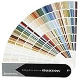
- Complete Benjamin Moore color collections
- High quality paper construction
- Well packaged arrives without bends
- Easy to fan out and compare colors
- Affinity colors designed to coordinate
- Does not include LRV values
- Not all current colors included
- 2021 Color of Year not included
The Benjamin Moore Collections Fan Deck is an essential tool for anyone serious about selecting the perfect bedroom paint color. Having all colors at your fingertips eliminates the guesswork and multiple store trips that often accompany paint selection. The high-quality paper construction means these chips will last through multiple projects.
I keep this fan deck in my design kit and reference it constantly when planning bedroom makeovers. The ability to fan out multiple colors and compare them side by side in the actual room you are painting is invaluable. Colors look completely different under your home’s lighting than they do under store fluorescents.
What Makes This Tool Special
The Affinity collection colors are specifically designed to coordinate, taking the guesswork out of creating cohesive color schemes. For whole-house painting or planning multiple rooms, this deck provides the comprehensive reference you need to make confident decisions.
Best Applications
This fan deck is essential for anyone planning multiple room makeovers, professional designers, or homeowners who want to make informed color decisions. It pays for itself by preventing even one paint color mistake. Use it to compare colors in your actual lighting before committing to gallons of paint.
16. Sherwin-Williams Colors Collection Deck – Ultimate Color Library
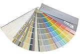
- Every color imaginable complete collection
- Much more convenient than store trips
- Easy to see full array for whole-house painting
- Great for viewing colors in natural home light
- Quality construction will last for years
- Can be overwhelming with so many colors
- Large collection may require time to navigate
The Sherwin-Williams Colors Collection Deck is the most comprehensive color reference tool available for this popular paint brand. With every color at your disposal, you can explore options you might never have considered and find the exact perfect shade for your bedroom vision.
The convenience factor cannot be overstated. Instead of making multiple trips to the paint store, gathering samples, and second-guessing yourself, you have the entire color library at home. This is particularly valuable for bedrooms where lighting conditions can dramatically affect how colors appear.
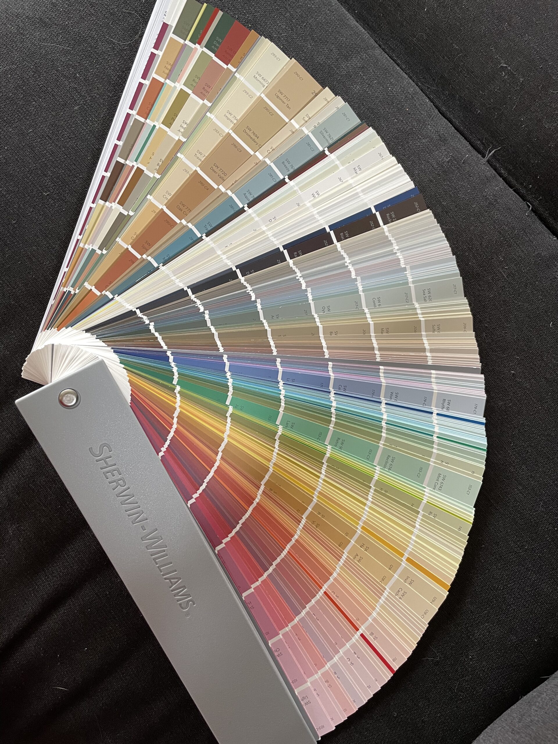
With 804 reviews and an impressive 4.8-star rating, this deck has proven its value to homeowners and professionals alike. The water-resistant construction means it will last through years of projects, and the compact 2-pound weight makes it portable enough to carry between rooms.
What Makes This Tool Special
This deck eliminates the low-tech method of matching paint colors that professionals used for decades. No batteries, Bluetooth, or internet required. Just real color chips you can hold against your walls, furniture, and textiles to see exactly how colors will work in your actual space.
Best Applications
This deck is perfect for anyone planning extensive painting projects, from single bedrooms to whole-home makeovers. The investment pays for itself by preventing costly color mistakes. The comprehensive nature means you will never need to visit a store to see a color option, everything is right at your fingertips.
How to Choose the Right Bedroom Paint Color
Selecting from the best bedroom paint colors is only the first step. Understanding how to evaluate colors for your specific space ensures you will love the result for years to come. Here is what our testing and research has revealed about making the right choice.
Understanding Paint Undertones
Every paint color has undertones that emerge under different lighting conditions. Grays may have blue, green, or purple undertones. Beiges can lean pink, yellow, or green. These undertones become more apparent when the color covers large wall areas. Test paint samples on multiple walls and observe them at different times of day before committing.
The forum discussions we analyzed revealed this as the number one source of paint regret. Colors that look perfect on a small chip can feel completely different when expanded to wall size. Always test before you invest in full gallons.
Consider Your Natural Light
North-facing rooms receive cooler, indirect light that can make colors appear darker and more muted. Warm tones help counteract this effect. South-facing rooms get warm, direct sunlight that can intensify colors. East-facing rooms have bright morning light that shifts throughout the day. West-facing rooms warm up significantly in the afternoon.
For more on using neutral colors effectively, see our neutral color design ideas.
Paint Finish Selection for Bedrooms
The finish affects both appearance and practicality. Eggshell is the traditional bedroom choice, offering a subtle glow and reasonable durability. Matte provides a sophisticated, light-absorbing finish ideal for moody bedrooms but shows marks more easily. Satin adds more sheen and washability, good for children’s rooms or high-use spaces. Semi-gloss offers maximum durability and reflects the most light.
For most adult bedrooms, eggshell strikes the right balance between beauty and practicality. For kids’ rooms or spaces that need frequent cleaning, consider satin or semi-gloss.
Frequently Asked Questions About Bedroom Paint Colors
What is the most popular paint color for bedrooms?
The most popular bedroom paint color is warm gray, specifically greige tones that blend gray and beige. Revere Pewter by Benjamin Moore and Agreeable Gray by Sherwin-Williams consistently rank as top choices because they offer versatility, warmth, and timeless appeal that works with virtually any decor style.
What are the top 3 bedroom colors?
The top three bedroom colors are warm neutrals like greige and accessible beige, soft blues and blue-greens like Sea Salt, and classic whites with warm undertones like Linen White. These colors promote relaxation, work with various lighting conditions, and provide flexibility for changing decor.
What color is replacing grey?
Warm earthy tones are replacing cool gray as the dominant bedroom color trend. Think sage greens, terracotta, warm beiges, and creamy whites. These colors bring natural, organic feelings to bedrooms while maintaining the versatility that made gray popular. However, greige which combines gray and beige remains a safe transitional choice.
What is the 60 30 10 rule for bedrooms?
The 60-30-10 rule is a classic design guideline for color distribution. Sixty percent of the room should be your dominant color, typically walls. Thirty percent is your secondary color for furniture and textiles. Ten percent is your accent color for accessories and decor. For bedrooms, this might mean neutral walls, wood furniture, and colorful throw pillows or artwork.
Which color is most attractive for a bedroom?
Blue is scientifically considered the most attractive and restful bedroom color. Research shows blue tones can lower heart rate and reduce blood pressure, promoting better sleep. Soft blues, blue-grays, and blue-greens like Sea Salt consistently rank as the most appealing choices for creating a calming, attractive bedroom environment.
Final Thoughts on Best Bedroom Paint Colors
The 16 best bedroom paint colors we have covered represent the full spectrum of options for transforming your sleep space in 2026. From timeless warm grays like Revere Pewter to calming blue-greens like Sea Salt, and from dramatic charcoals to sophisticated navies, there is a perfect color for every bedroom and personal style.
Remember that the best bedroom paint colors do more than cover walls. They create atmosphere, influence mood, and can even improve sleep quality. Take time to test samples in your actual space, consider your natural light, and choose a finish that balances beauty with practicality for your lifestyle.
Whether you opt for our Editor’s Choice Revere Pewter, the Best Value Agreeable Gray, or any of the other exceptional colors featured here, you are investing in the space where you spend nearly a third of your life. For additional guidance on painting projects, explore our painting tips for home renovations. Here is to creating the bedroom retreat you deserve.