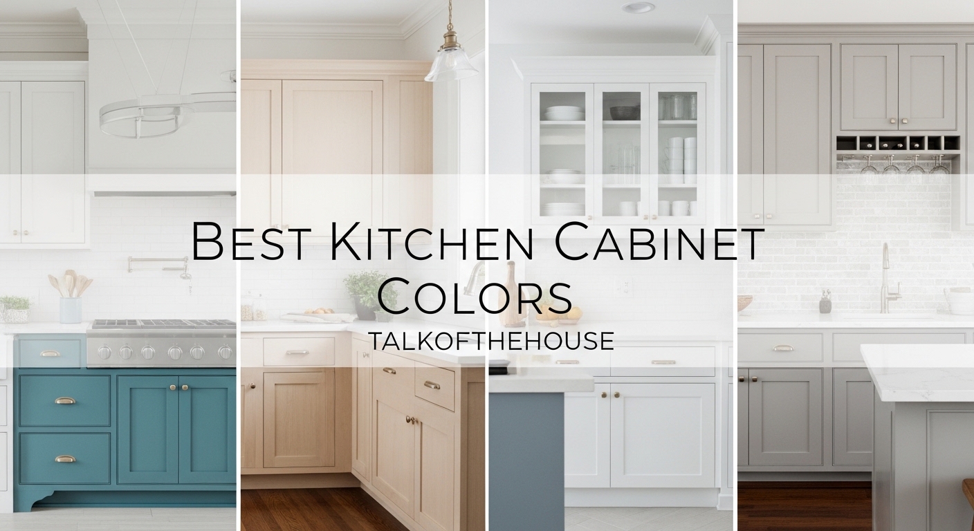
The best kitchen cabinet colors for 2026 mark a dramatic shift away from the stark, clinical whites that dominated the past decade. Homeowners and designers alike are embracing warmer, more inviting palettes that transform kitchens into spaces where people actually want to gather. After reviewing hundreds of kitchen renovations and consulting with paint experts, I’ve identified the eight colors that are defining kitchen design in 2026.
These trending cabinet colors draw inspiration from nature, vintage aesthetics, and a collective desire for comfort in our homes. From soft sage greens that bring the outdoors in to rich terracotta tones that add Mediterranean warmth, this year’s palette reflects a more thoughtful approach to kitchen design. The focus is on creating spaces that feel lived-in, welcoming, and genuinely personal.
Whether you’re planning a complete kitchen overhaul or simply refreshing your existing cabinets, this guide covers everything you need to know. I’ll share specific paint codes from Benjamin Moore, Sherwin Williams, and Behr, plus tips on which colors work best for different kitchen sizes and lighting conditions.
Table of Contents
Warm Cream and Off-White: The New White
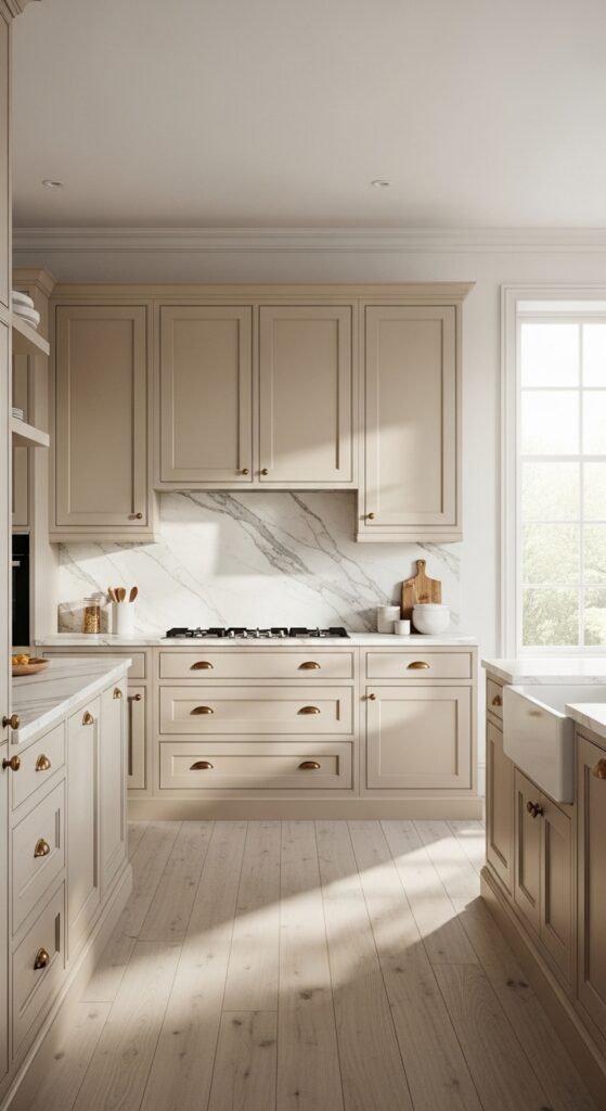
Stark white cabinets are officially taking a back seat to warmer, creamier alternatives in 2026. These softer whites create the bright, airy feel homeowners love while eliminating the cold, sterile edge that pure white can bring. The result is a kitchen that feels fresh yet welcoming, like a perfectly worn pair of linen sheets.
The shift toward warm cream reflects a broader trend in interior design toward comfort and authenticity. Pure white can sometimes feel clinical or overly modern, whereas cream tones add subtle warmth that works beautifully with natural materials like wood and stone. These colors also age more gracefully, hiding minor wear and maintaining their appeal through changing trends.
Benjamin Moore’s White Dove remains the gold standard for cream cabinet colors. It reads as white in bright light but reveals subtle warm undertones in the evening. Sherwin Williams Alabaster offers a similar effect with slightly more beige influence, while Behr’s Swiss Coffee provides an affordable option that delivers professional results.
When selecting a cream or off-white for your cabinets, consider your countertop and backsplash materials. These colors pair beautifully with marble, quartz with warm veining, and natural wood accents. Brass and matte black hardware both complement warm whites equally well, giving you flexibility in your finishing touches.
Sage and Olive Green: Nature’s Calming Influence
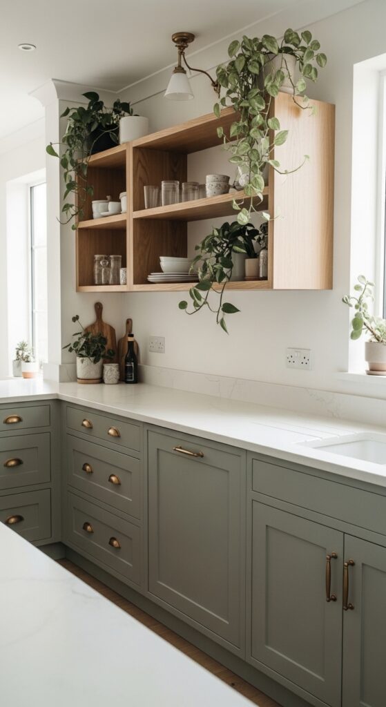
Sage and olive green kitchen cabinets have emerged as the breakout stars of 2026, bringing the soothing qualities of nature directly into the heart of the home. These muted greens work like a neutral while offering far more personality than beige or gray ever could. They evoke herb gardens, olive groves, and the kind of European country kitchens that make you want to linger over coffee.
The appeal of sage green lies in its remarkable versatility. It functions as a sophisticated neutral that complements both traditional and contemporary design schemes. In kitchens with abundant natural light, sage reads fresh and lively. In dimmer spaces, it becomes moody and atmospheric without feeling dark or oppressive.
Sherwin Williams Sage Green Light captures the essence of this trend perfectly. It sits right in the middle of the sage spectrum, not too yellow and not too gray. Benjamin Moore’s Saybrook Sage offers a slightly deeper option with more gray undertone, while Farrow & Ball’s Green Smoke delivers a more saturated, heritage-inspired look for those seeking drama.
Hardware selection becomes particularly important with green cabinets. Brushed brass creates a warm, organic pairing that emphasizes the natural quality of the color. Matte black offers striking contrast, while oil-rubbed bronze grounds the look in traditional craftsmanship. Consider open shelving in natural oak or walnut to enhance the earthy, collected-over-time aesthetic.
Terracotta and Earth Tones: Mediterranean Warmth Returns
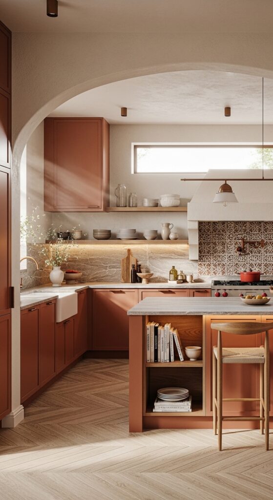
Terracotta kitchen cabinets represent one of the most exciting comebacks in 2026 design trends. After years of cool grays and stark whites dominating kitchen design, this warm, sun-baked clay color brings undeniable energy and warmth to cooking spaces. It channels the spirit of Mediterranean villas, desert landscapes, and handmade pottery.
The key to successfully using terracotta lies in choosing the right shade depth. Lighter terracotta tones with more pink or salmon influence work beautifully in smaller kitchens or spaces with limited natural light. Deeper, more orange-forward terracotta makes a dramatic statement in larger kitchens or on islands where it can anchor the room without overwhelming it.
Sherwin Williams Cavern Clay has become the go-to terracotta for kitchen cabinets. It strikes the perfect balance between orange and brown, reading as warm and inviting without feeling overwhelming. Benjamin Moore’s Terra Mauve offers a slightly dustier, more muted interpretation, while Behr’s Canyon Wind provides an accessible option that captures the essence of the trend.
Countertop selection becomes crucial when working with terracotta cabinets. Creamy whites, warm grays, and natural stone with beige or brown veining all complement this color beautifully. Avoid cool-toned grays or stark whites, which can create jarring contrast. Open shelving in natural wood or floating shelves against a terracotta backsplash can break up the color while maintaining the warm palette.
Mushroom and Taupe: The Sophisticated Neutral
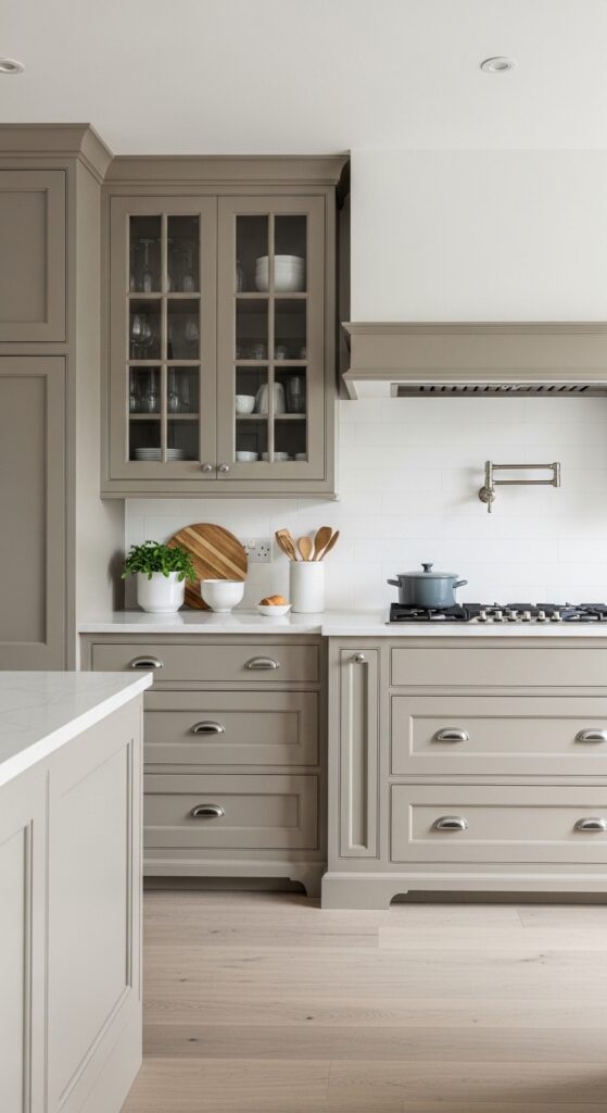
Mushroom and taupe kitchen cabinets have become the secret weapon of sophisticated designers in 2026. These complex neutrals shift between gray and beige depending on the light, creating dynamic spaces that never feel flat or boring. They offer all the versatility of gray with the warmth that modern homeowners crave.
The magic of mushroom and taupe lies in their chameleon-like quality. In morning light, they might read as warm gray. By evening, the same cabinets can appear distinctly beige or greige. This shifting quality keeps the kitchen feeling alive and responsive to the changing day, unlike static colors that look identical from dawn to dusk.
Benjamin Moore’s Revere Pewter has achieved iconic status as the perfect mushroom taupe. It works with virtually any countertop material and adapts to both north and south-facing kitchens with grace. Sherwin Williams Agreeable Gray offers a lighter alternative with similar adaptability, while Behr’s Mushroom Bisque brings a slightly warmer, more beige-forward option to the table.
These colors excel when paired with mixed metals. The neutral warmth of mushroom and taupe provides the perfect backdrop for combining brass, black, and even chrome hardware within the same kitchen. Textural elements like natural fiber rugs, woven pendant lights, and ceramic accessories feel right at home against these earthy cabinet colors.
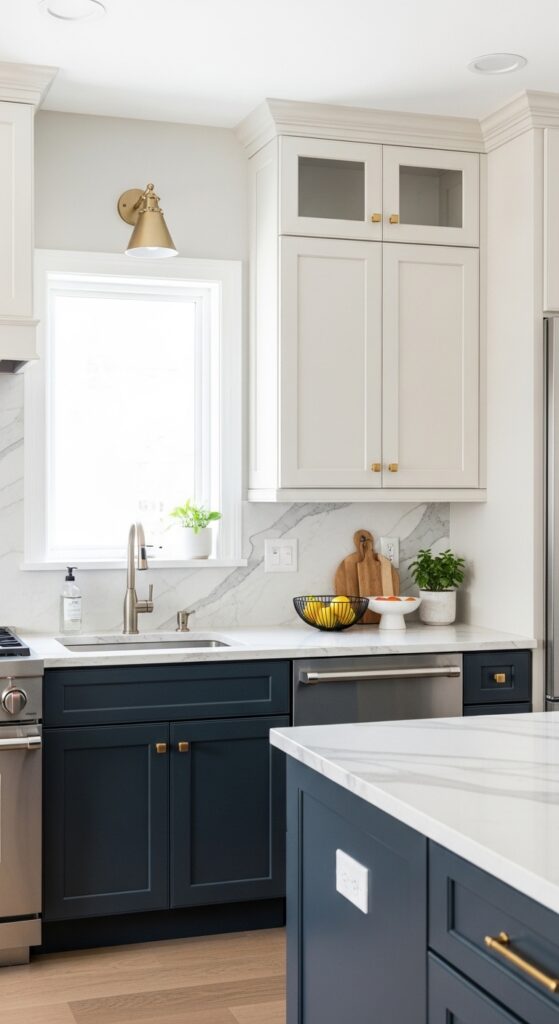
Navy Blue: Timeless Drama with Modern Appeal
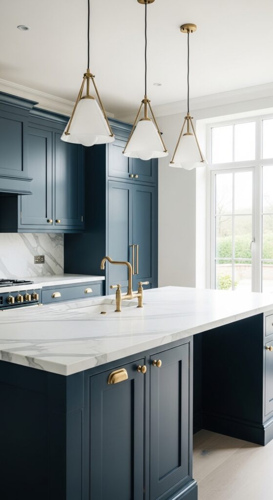
Navy blue kitchen cabinets continue their reign as the ultimate choice for homeowners seeking sophistication without sacrificing warmth. This classic color has transcended its traditional associations to become equally at home in coastal cottages and urban lofts. In 2026, navy feels fresher than ever as designers pair it with unexpected materials and finishes.
The enduring appeal of navy lies in its remarkable depth and versatility. Unlike black, which can feel heavy or overwhelming, navy maintains a richness that feels inviting. It absorbs light beautifully without making spaces feel cave-like, and it provides the perfect backdrop for both silver and gold accents. Navy also has the rare quality of looking equally stunning in modern flat-panel cabinets and traditional raised-panel designs.
Benjamin Moore’s Hale Navy remains the undisputed champion of navy cabinet colors. Its perfect balance of blue and black undertones ensures it never reads as purple or too bright. Sherwin Williams Naval offers a slightly brighter alternative with more blue influence, while Farrow & Ball’s Hague Blue delivers a greener, more complex navy that evokes English country houses and vintage libraries.
Brass hardware against navy cabinets creates one of the most striking combinations in kitchen design. The warm metal pops against the deep blue, creating instant visual interest. Marble countertops with gray veining or quartz in similar tones complete the classic look. For a more contemporary edge, pair navy with concrete countertops and matte black fixtures.
Forest and Deep Greens: Moody Elegance
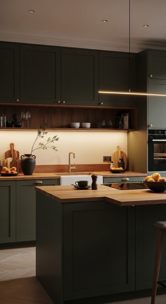
Forest and deep green kitchen cabinets bring a sense of heritage and permanence that lighter colors simply cannot match. These saturated greens evoke vintage libraries, English hunting lodges, and the quiet dignity of old-growth forests. In 2026, they represent a rejection of disposable trends in favor of colors that feel timeless and substantial.
The key to working with deep greens is understanding their transformative effect on kitchen atmosphere. These colors create intimate, cocoon-like spaces that feel worlds away from the bright, open kitchens of recent years. They work particularly well in larger kitchens where they can define the space without making it feel closed in, and they excel on kitchen islands where they can anchor the room’s design.
Benjamin Moore’s Essex Green delivers the perfect heritage-inspired forest tone. It reads as sophisticated rather than trendy, with brown undertones that add warmth to the deep green base. Sherwin Williams Rookwood Dark Green offers a slightly more subdued option with historical authenticity, while Behr’s Rainforest provides a more accessible deep green that works well in contemporary settings.
Lighting becomes essential when working with deep green cabinets. Under-cabinet lighting, glass-front upper cabinets, and strategic pendant placement prevent these colors from feeling too heavy. Natural wood accents in oak or walnut provide beautiful contrast, while cream or off-white walls keep the overall feeling fresh. Consider mixing deep green base cabinets with lighter uppers for a balanced approach.
Rich Wood Tones: The Natural Wood Revival
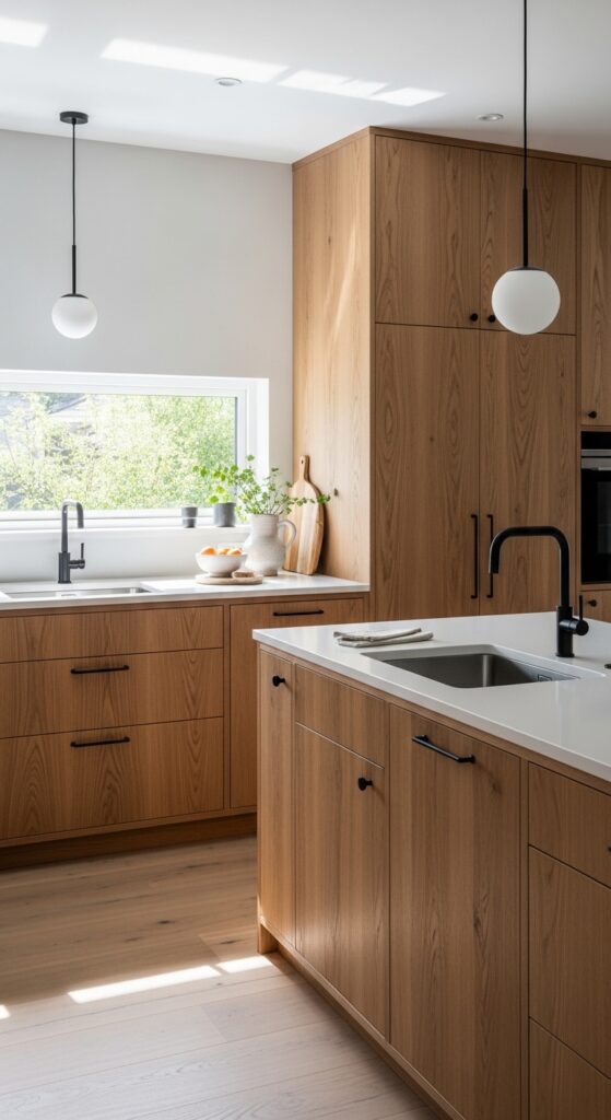
Rich wood tones have made a triumphant return to kitchen cabinet design in 2026, marking a shift away from painted finishes toward natural materials. Walnut, oak, and cherry are reclaiming their place as the ultimate expression of quality and craftsmanship. This trend reflects a broader desire for authenticity and connection to natural materials in our homes.
The wood tone revival isn’t simply about nostalgia. Modern finishing techniques allow wood cabinets to feel contemporary while retaining their organic warmth. Clear stains and natural oils showcase the wood’s grain and character rather than hiding it under opaque paint. The result is kitchens that feel grounded, honest, and designed to last generations rather than follow fleeting trends.
Walnut has emerged as the premium choice for wood kitchen cabinets in 2026. Its rich chocolate tones and distinctive grain patterns make every kitchen unique. Minwax Walnut stain provides a classic option for DIY enthusiasts, while professional cabinet makers might use Rubio Monocoat or Osmo Polyx Oil for a more natural, hand-rubbed finish. For lighter wood tones, white oak with clear finish or Varathane’s Early American stain offers beautiful golden warmth.
The key to making wood cabinets feel contemporary lies in the surrounding elements. Pair them with clean-lined hardware in matte black or brushed brass. Choose simple, flat-panel door styles over ornate traditional designs. Concrete, quartz, or simple white countertops provide the perfect counterbalance to wood’s organic complexity. The goal is letting the wood be the star while everything else supports it.
Two-Tone Combinations: Strategic Contrast
Two-tone kitchen cabinets have evolved from a novelty into a sophisticated design strategy that adds depth and visual interest to any kitchen. This approach involves using different colors for upper and lower cabinets, or creating an accent island that stands apart from the perimeter cabinetry. In 2026, designers are getting more creative with these combinations than ever before.
The most successful two-tone kitchens follow a clear hierarchy. Typically, darker colors anchor the lower cabinets while lighter shades on top keep the space feeling open and airy. This arrangement draws the eye upward, making ceilings feel higher and rooms feel larger. Alternatively, using a bold color on just the kitchen island creates a furniture-like focal point without overwhelming the entire space.
Classic pairings for 2026 include navy lower cabinets with warm cream uppers, forest green bases with soft white tops, and charcoal lowers with light gray uppers. For the island-as-accent approach, consider painting just this central piece in terracotta, deep green, or even black while keeping perimeter cabinets in a neutral cream or white. The contrast creates visual rhythm and breaks up the monotony of single-color kitchens.
When planning a two-tone kitchen, consider the sightlines from adjacent rooms. The color transition should feel intentional, not arbitrary. Use the darker color consistently on all base cabinets and the island for a cohesive look, or commit fully to the island-as-furniture concept with a completely different hue. Hardware choices can bridge the two colors, using the same finish throughout to create continuity.
Paint selection requires careful coordination when working with two colors. Choose colors with similar undertones, warm with warm or cool with cool, to prevent clashing. Test samples in the actual kitchen space, viewing them together at different times of day. The goal is creating a kitchen where the two colors feel like they were always meant to coexist.
FAQ: Choosing the Best Kitchen Cabinet Colors for 2026
What is the most popular kitchen cabinet color for 2026?
Warm cream and off-white have overtaken stark white as the most popular kitchen cabinet color in 2026. Benjamin Moore White Dove and Sherwin Williams Alabaster lead the trend, offering bright, airy feels with added warmth that makes kitchens feel welcoming rather than clinical.
Are gray kitchen cabinets still in style for 2026?
Gray cabinets remain popular but have shifted toward warmer, greige and mushroom tones rather than cool grays. Colors like Benjamin Moore Revere Pewter and Sherwin Williams Agreeable Gray offer the sophistication of gray with the warmth that 2026 homeowners prefer.
What kitchen cabinet colors work best in small kitchens?
Light colors work best in small kitchens, including warm creams, soft sage greens, and light mushroom tones. These shades reflect light and make spaces feel larger. Consider two-tone combinations with lighter uppers and darker lowers to add interest without overwhelming the space.
What finish should I choose for kitchen cabinets in 2026?
Matte and satin finishes are preferred over high-gloss for 2026 kitchen cabinets. These lower-sheen options hide imperfections better and create a more sophisticated, less industrial appearance. Satin offers slightly more durability for high-traffic kitchens while matte provides the most modern aesthetic.
Should I hire a professional or paint kitchen cabinets myself?
Professional cabinet painting typically delivers superior, longer-lasting results, especially for complex colors or wood grains. However, DIY painting can work well if you invest in proper preparation, quality primer, and high-grade paint. The key is patience, thorough cleaning, sanding between coats, and allowing adequate drying time.
Final Thoughts: Making Your Choice
The best kitchen cabinet colors for 2026 share one common quality: they prioritize warmth and authenticity over stark perfection. Whether you choose creamy off-whites, nature-inspired greens, or rich wood tones, the goal is creating a kitchen that feels genuinely lived-in and welcoming. These colors invite you to cook, gather, and make memories rather than simply admire a perfect aesthetic.
Before committing to any cabinet color, invest in sample boards and observe them in your actual kitchen throughout the day. Colors shift dramatically under morning sunlight versus evening artificial light, and what looks perfect in a showroom might feel completely different in your space. Live with samples for at least three days before making your final decision.
Remember that the best kitchen cabinet color is ultimately the one that makes you happy every time you walk into the room. Trends provide guidance, but your personal connection to the space matters most. Whether you follow the warm neutral wave of 2026 or forge your own path, choose a color that reflects how you want to feel in your home.